
KUBO AND THE TWO STRINGS
Concept, Teaser Poster, Theatrical Key Art
Challenges
To design two posters that serve different purposes: one that withholds, one that reveals, without losing visual consistency between them.
-
To design two posters that serve different purposes: one that withholds, one that reveals, without losing visual consistency between them.
-
A consistent background, and controlled palette ensured cohesion, while allowing each poster to fulfill its unique role. The teaser builds mystery through absence. The theatrical communicates scale and character.
Solutions
Each poster is anchored by the same warm palette and title treatment. A consistent background, and controlled palette ensured cohesion, while allowing each poster to fulfill its unique role. The teaser builds mystery through absence. The theatrical communicates scale and character.
Key Art
*
Key Art *

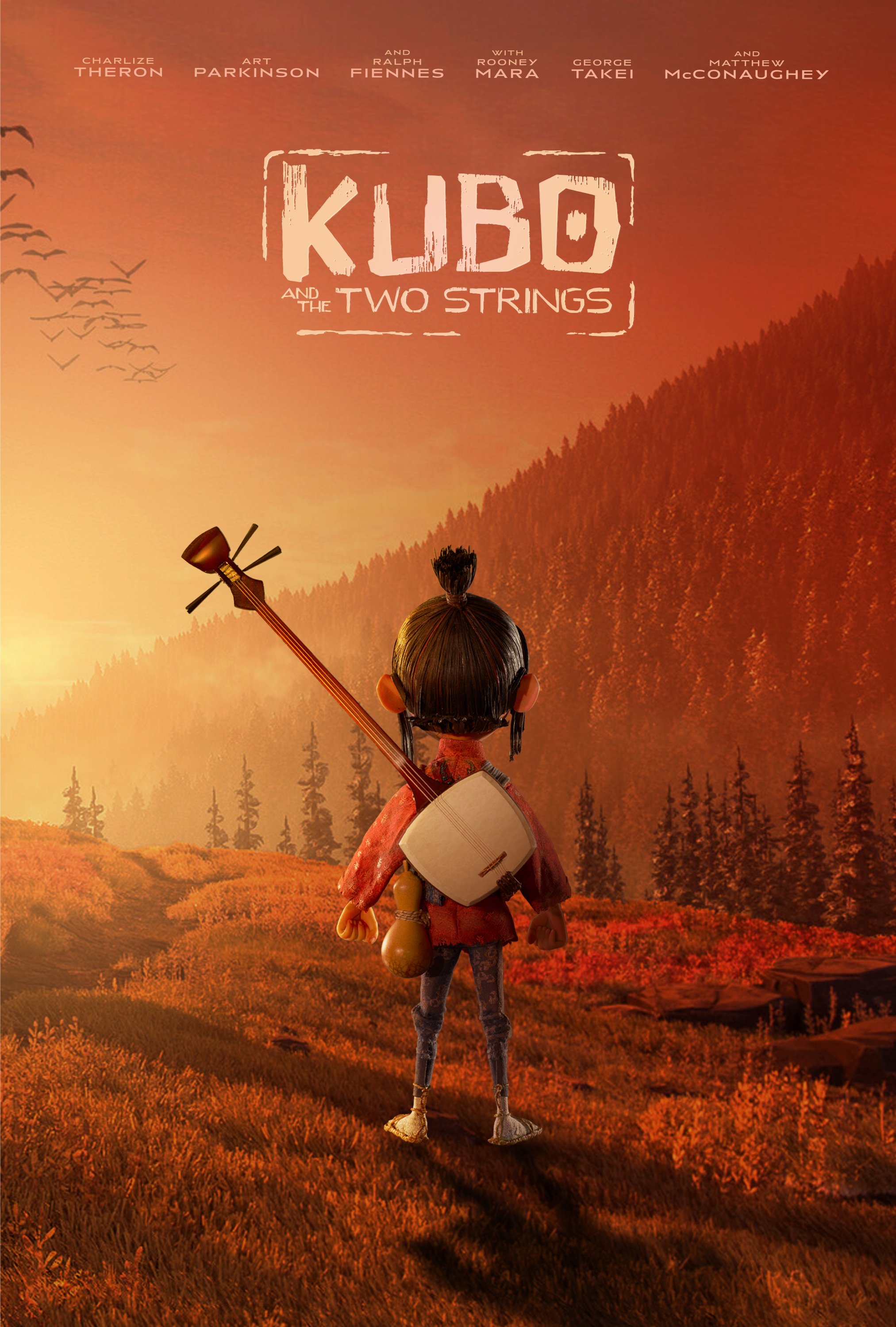
Teaser Poster
I used Kubo’s shamisen as a stand-in for storytelling, heritage, and inner strength, without showing Kubo himself. By keeping the environment dark and minimal, I let the warm amber lighting and floating origami suggest the film’s magic and mythology without giving anything away.
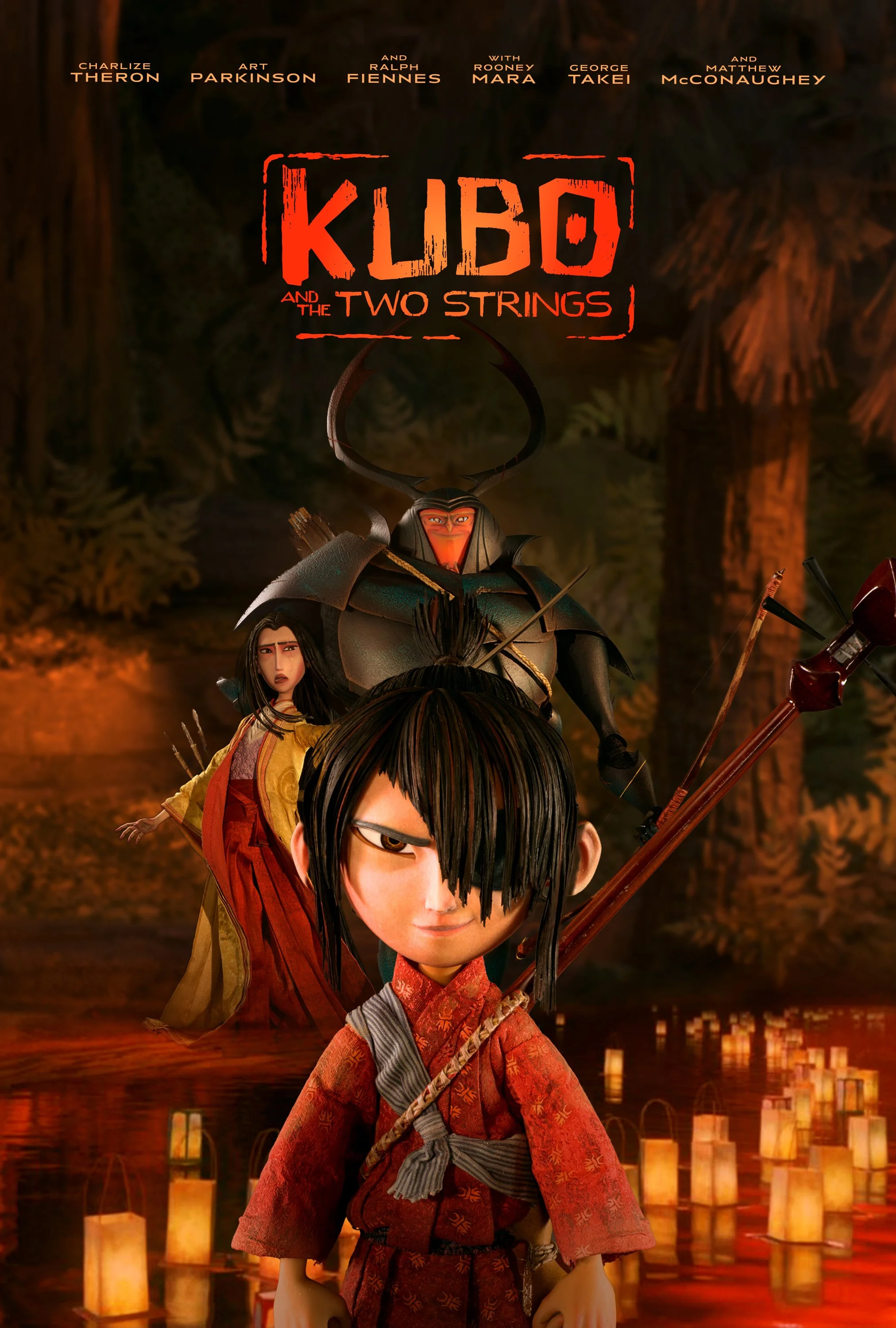
Theatrical Poster
I brought Kubo front and center and built the composition around him. I layered the supporting characters behind to establish scale, conflict, and lineage without letting them compete for attention, using warm lantern light and deep forest tones to create a mythic, cinematic atmosphere.